For: TruckSmarter
Role: User research, UX & Interaction design
Launch a credit program to better support truck drivers and make TruckSmarter an even more integral part of their business
Background
What is TruckSmarter?
TruckSmarter’s mission is to empower truck drivers by offering a one-stop platform that helps them grow their business and manage their finances effectively.
What is Project AirRide?
A major pain point for truck drivers is limited working capital; a truck breakdown or unexpected issue can severely disrupt their business. Project AirRide aimed to address this by launching a line of credit program, giving truck drivers access to essential funds directly through the TruckSmarter mobile app.
What was the scope of work?
Designed and launched a 0-1 product from the ground up, leading it through every stage from initial concept to final designs. Conducted comprehensive user research to deeply understand our target audience's needs and pain points, shaping a design strategy that addressed real problems effectively. Leveraged these customer insights to inform and refine the design, while collaborating closely with cross-functional partners to successfully bring the product to market.
Final Experience
Key screens showing the sign up screen through booking a fuel reservation through AirRide
The Design Process
User research
Conducted a two-week user research study to understand our customers' pain points and their relationship with credit. One key insight revealed that truck drivers overwhelmingly prefer to use credit for fuel and maintenance, as these represent their largest expenses.
Figjam of the raw notes from each driver, which were then clustered into insights
User journeys
Since this was our first venture into credit, I felt it was crucial to clearly illustrate our customers' needs to effectively convey the vision to all cross-functional stakeholders.
Wireframes & user flows
Once we reached alignment on the solution we wanted to create, I transitioned into mapping out the product experience through wireframes. This low-fidelity approach enabled us to move quickly, shaping the user experience while also identifying edge cases that needed to be addressed. It also provided the engineering team with a clear understanding of the workflow, allowing them to start building the product’s framework in parallel, even before the high-fidelity designs were finalized.
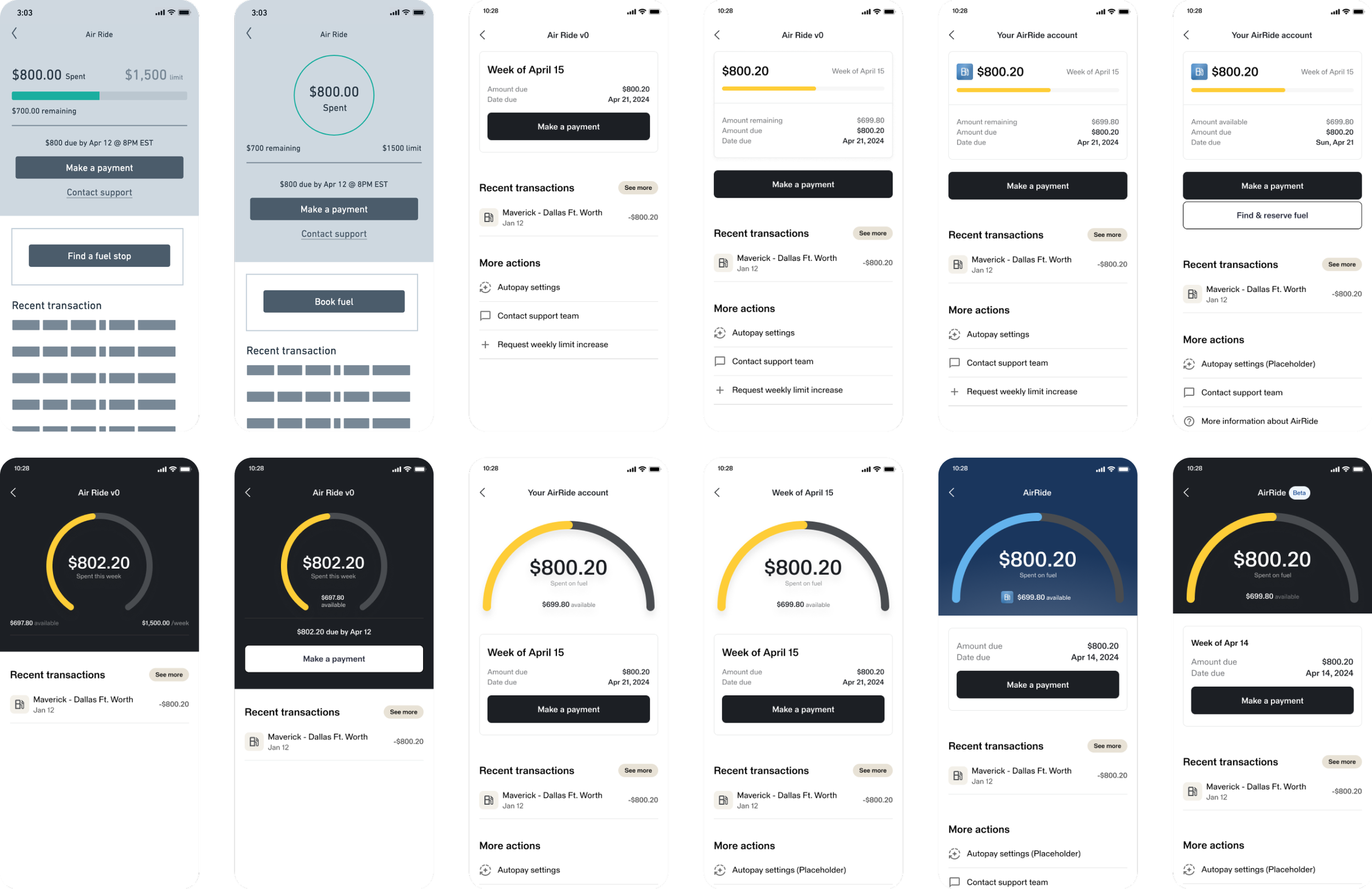
Design and iterate
With the UX well-defined, I had the opportunity to explore the visual design for the final product experience. This iterative process allowed me to experiment with bold ideas and then gradually refine them into a feasible solution that aligned with the project's time constraints.
Launch & Learn
The product was initially released to a group of 15 customers for beta testing. As we gathered insights from this phase, we refined and calibrated the experience before gradually rolling it out to all qualified customers.
Within the first three months, over 50% of onboarded customers were using the line of credit weekly. This strong engagement gave the team the confidence to invest additional resources into further enhancing the feature.


